The Brand

The Narrative
The rebranding of Forward Creative Consultants (FCC) required a logo that encapsulated the essence of their business and their deep-rooted connection to nature. Our objective was to create a visual identity that not only stood out but also reflected their commitment to organic, healthy ingredients and their unique story.
Concept and Design:
The design process began with understanding the core values and heritage of FCC. Despite an initial consideration for a minimalistic and bold design, it became clear that FCC’s identity was intertwined with their roots, their land, and the organic materials they passionately cultivate. The founders emphasized their connection to their farm and the meticulous care they put into their produce.
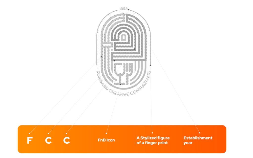
To visually represent this connection, we created a stylized yet robust fingerprint logo. The fingerprint symbolizes the unique and lasting impression FCC aims to leave on their clients through their natural products and carefully curated menus. Within this fingerprint, we subtly embedded the three letters “FCC,” reinforcing the brand’s identity and the personal touch they bring to their consultancy services.

Inspiration struck from a striking piece of artwork depicting three stylized figures in motion, symbolizing teamwork and dynamic collaboration. This artwork resonated deeply with FCC’s core team of three consultants and their harmonious working relationship.
To visually represent this connection and inspiration, we created a stylized yet robust fingerprint logo. The fingerprint symbolizes the unique and lasting impression FCC aims to leave on their clients through their natural products and carefully curated menus. Within this fingerprint, we subtly embedded the three letters “FCC,” reinforcing the brand’s identity and the personal touch they bring to their consultancy services. The three intertwined figures from the artwork influenced the design, highlighting the unity and synergy between the three founders.
Color and Symbolism:
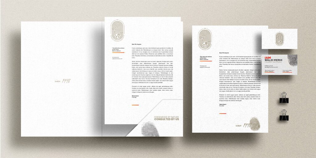
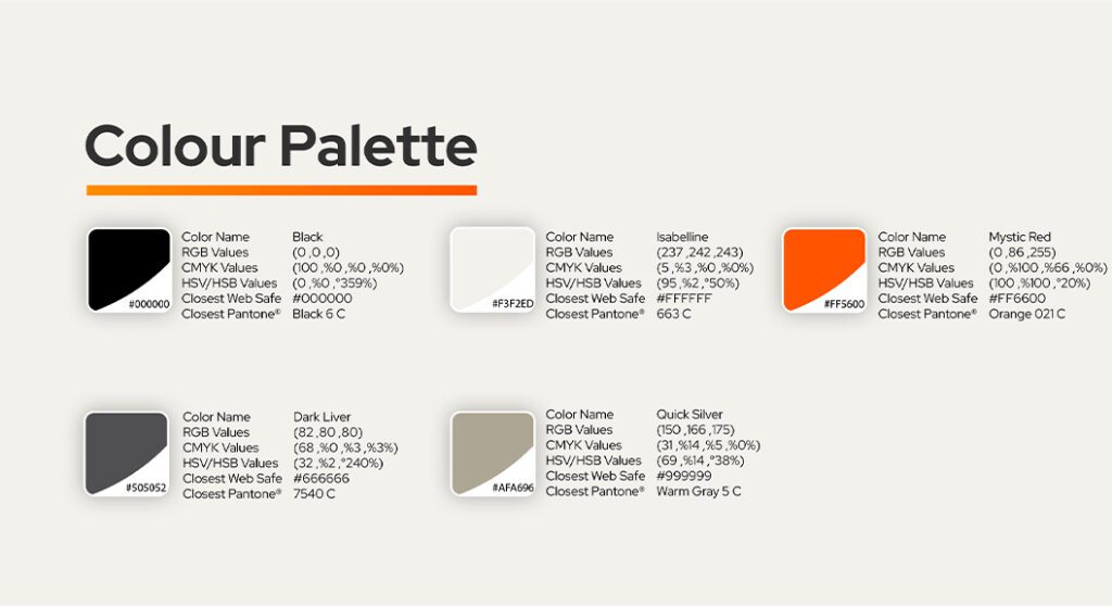
The color palette plays a crucial role in conveying FCC’s brand message. We chose a vibrant orange to reflect the freshness and vitality of their products, paired with earthy tones that symbolize the fertile soil from which their ingredients are sourced. This combination not only highlights the organic nature of their offerings but also speaks to their dedication to quality and authenticity.
Impact and Meaning:
The final logo design for FCC is a powerful representation of their brand. It encapsulates their journey, their connection to the earth, and their promise of natural, high-quality products. The fingerprint motif, inspired by the collaborative artwork, serves as a reminder of the personal touch and the unique mark FCC leaves on their clients’ minds. This logo is not just a visual identifier but a symbol of FCC’s commitment to excellence and their deep-seated values.
The Website
The website for Forward Creative Consultancy (FCC) was designed to reflect their unique approach and bold vision. Just like their brand, the website needed to stand out and convey the innovative spirit of FCC.
Against all odds, we structured the website with a distinct and unconventional layout. The menu is placed at the bottom of the screen, symbolizing FCC’s commitment to originality and their belief that success comes from following their unique path, not from conforming to the norm. This design choice sends a powerful message to users: to experience true innovation and quality, one must embrace new perspectives and follow FCC’s expert guidance.
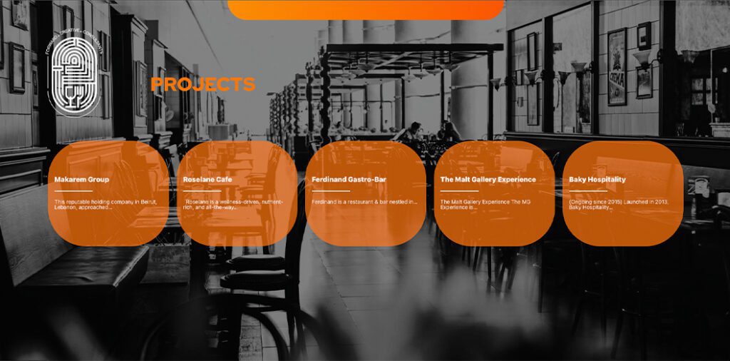
The website serves as a comprehensive showcase of FCC’s projects and portfolio. Each section is meticulously designed to highlight their exceptional work in the food and beverage industry, from the creative consultancy provided by the three founders to the successful resto-pubs and culinary projects they have brought to life.
